Ancestry inference
Given someone’s genotype, which populations did their DNA come from, and which stretches of which chromosome came from where? The question is easy to state and genuinely hard to answer well, because populations are fuzzy, reference panels are uneven, and the honest answer carries more uncertainty than most people expect.
myOrigins 3.0: solving both halves at once
Most ancestry pipelines do two jobs in sequence. First they estimate global ancestry, the overall percentages. Then they do local ancestry, assigning each segment of each chromosome to a population. Running them separately means the two can disagree, and they routinely do. The segments add up to something other than the percentages you just reported, and you are left choosing which number to show.
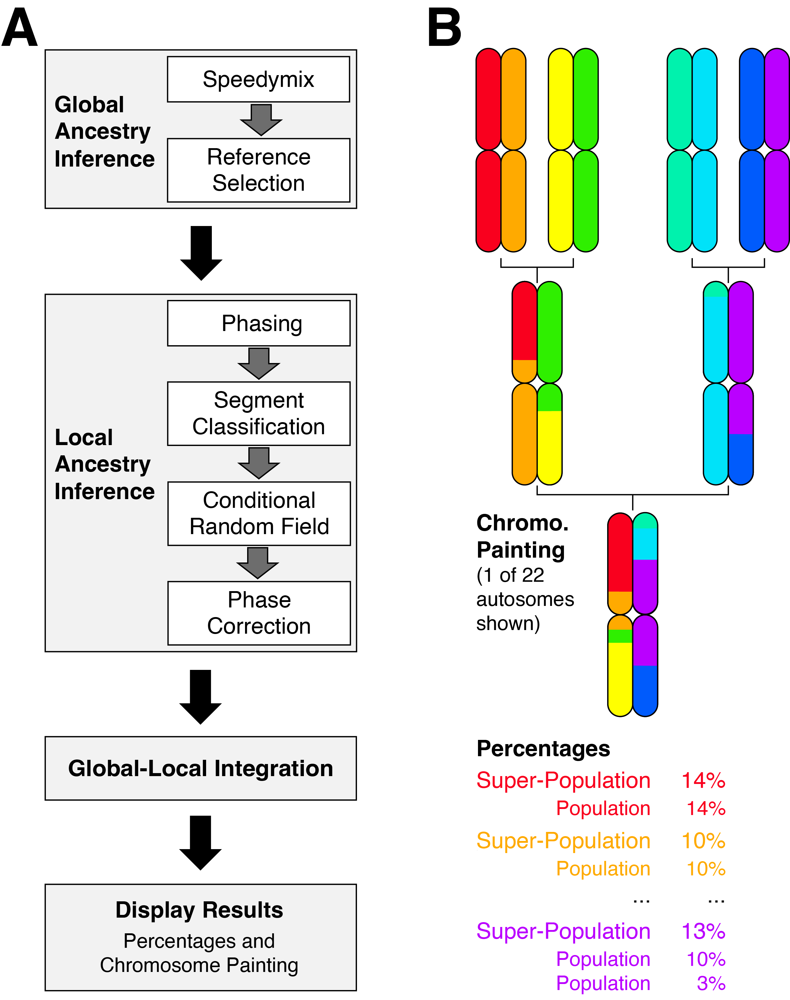
myOrigins 3.0 estimates both jointly. The segments and the totals are solved against each other, so they stay consistent by construction rather than by rounding. That change also made the method stable enough to support a much larger reference panel, and we expanded from 24 populations to 90.
What each piece does
Phasing separates the two chromosomes you inherited, combining exact identity-by-descent matches against the database with haplotype frequency information. Segment classification then walks along each phased chromosome in windows and assigns each one a population. Raw classifications are noisy, so a conditional random field smooths them by linking neighboring windows, which encodes the biological fact that ancestry arrives in tracts rather than as isolated points. Finally a hidden Markov model performs phase correction, repairing switch errors where imperfect phasing has assigned a stretch of ancestry to the wrong copy of a chromosome.
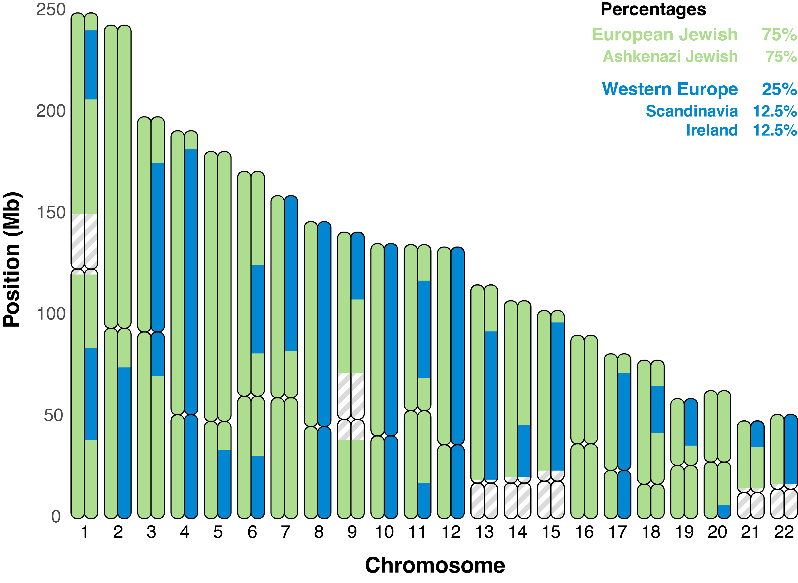
The chromosome painting is the part customers actually engage with, and it is more than decoration. Knowing that a particular ancestry sits on a specific stretch of chromosome 8 is genealogically useful, because it can be matched against relatives who share that same segment. A percentage cannot do that.
I recorded a three-part explainer to accompany the launch, covering what the report shows, how the method works, and why a particular population turns up in a particular result: Part 1, overview · Part 2, methodology · Part 3, interpreting your results.
Deciding what a population is
Building the reference panel was its own project, and the part I would defend most strongly. Deciding what counts as a population is partly a statistical question and partly a judgment call, and those choices propagate into every result the method will ever produce. Human population history is reticulated. Groups split, merge, and exchange migrants continuously, so any tree drawn through them is a simplification chosen for a purpose rather than a fact waiting to be discovered.
I assembled the panels from public and proprietary genotype resources, ran the quality control, and set both the population definitions and the hierarchy used to report them. Where the data could not support a distinction, the right answer was to report the coarser grouping rather than invent resolution that is not there.
Validation against held-out reference samples gives a mean accuracy of 0.89 ± 0.03, meaning the average reference individual has 89% of their ancestry assigned to their correct population. That is up from 0.84 ± 0.02 using the global method alone. Accuracy varies most in continents containing many closely related populations, which is exactly where you would expect it to.
Technical details
Global ancestry combines the customer sample with the reference panel at
379,880 SNPs and estimates proportions across 90 populations using
Speedymix, a fast method that multiplies global ancestry proportions by population
genotype frequencies. The output selects the relevant reference populations for the local stage.
Local ancestry phases 637,645 densely packed SNPs using
Eagle, which blends exact IBD matches with haplotype frequency estimation, then divides
each phased chromosome into evenly spaced windows for classification. The conditional random field
links adjacent windows to suppress isolated misclassifications, and a final HMM removes switch errors
introduced upstream.
The population hierarchy came from combining TreeMix, Speedymix,
hierarchical clustering on pairwise FST, and the published literature, then reconciling the
four. Super-population groupings drive the color scheme used in the chromosome painting.
Relatedness, and the endogamy problem
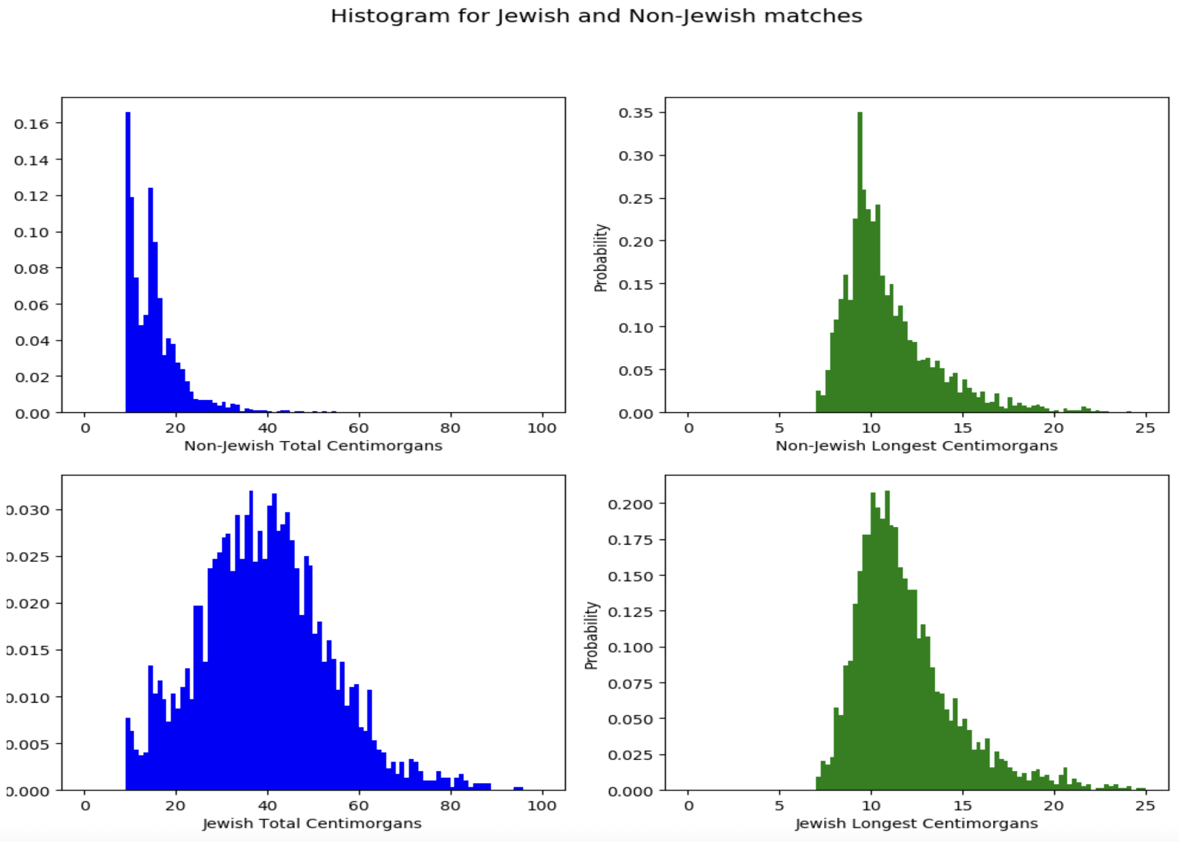
Estimating how two people are related from shared DNA is straightforward in outbred populations and badly misleading in populations that are not. In a community where people have married within the group for many generations, any two members share far more DNA than their documented relationship predicts, because they connect through dozens of paths in the pedigree rather than one.
A standard estimator reads that extra sharing as close kinship and confidently reports second cousins who are in fact much more distant. The failure is not random noise, it is a systematic bias in one direction, and it lands hardest on exactly the communities most invested in genealogical research.
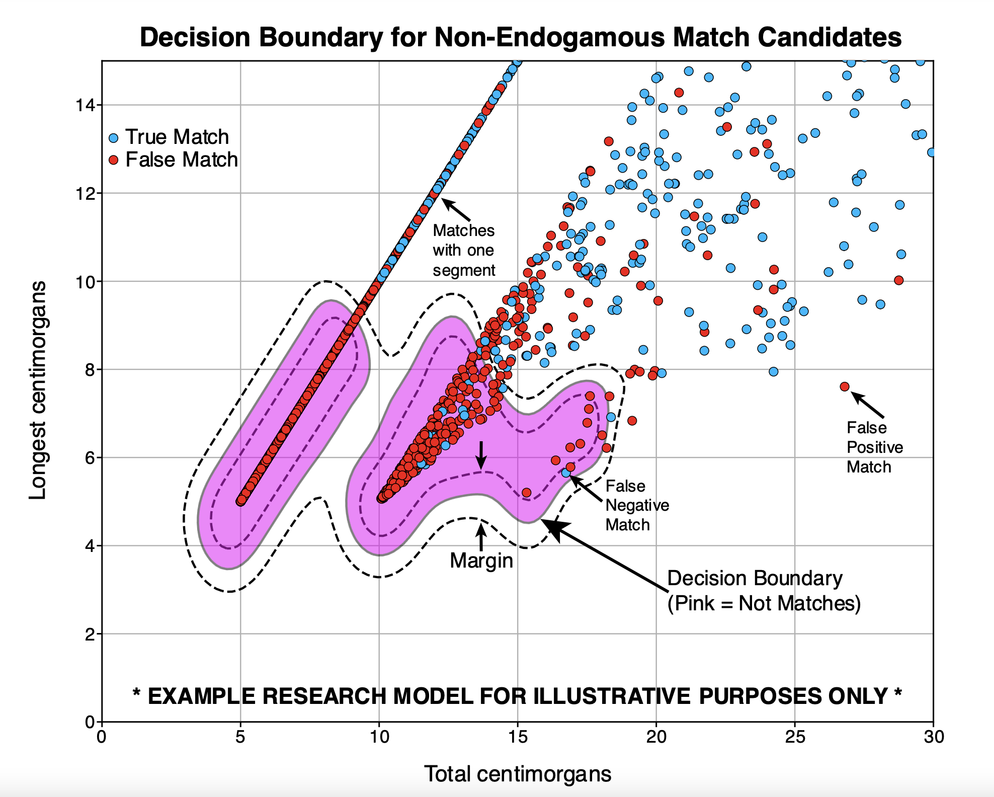
Family Finder Matching 5.0 handles this by classifying whether a match pair is endogamous before estimating the relationship, then applying a different model in each case. The relationship estimator itself was trained against simulated pedigrees extending to eighth cousins, which supplies a known answer to score predictions against. I contributed to the method and co-authored the white paper.
Technical details
Matching scans for qualified seed segments, requiring at least 900 matched SNPs with no mismatches before a seed is accepted. Seeds are then extended forward and backward and merged with nearby matched segments under a predefined error tolerance, which keeps genotyping error from fragmenting a single real segment into several short ones.
Endogamy classification and match classification both use supervised learning with decision boundaries fit on labeled populations. Relationship estimation draws on total shared centimorgans and longest shared segment, whose distributions separate relationship levels imperfectly and overlap considerably at greater genetic distances. Performance is reported as a confusion matrix rather than a single accuracy figure, because most errors are off by only one or two relationship levels and that distinction matters to a user.
Globetrekker: the route, not just the destination
Ancestry percentages tell you where your ancestors were. They do not tell you how they got there. Globetrekker takes a paternal lineage and reconstructs the route: which regions it passed through, in what order, across tens of thousands of years, drawn on a map of the world as it existed at the time.
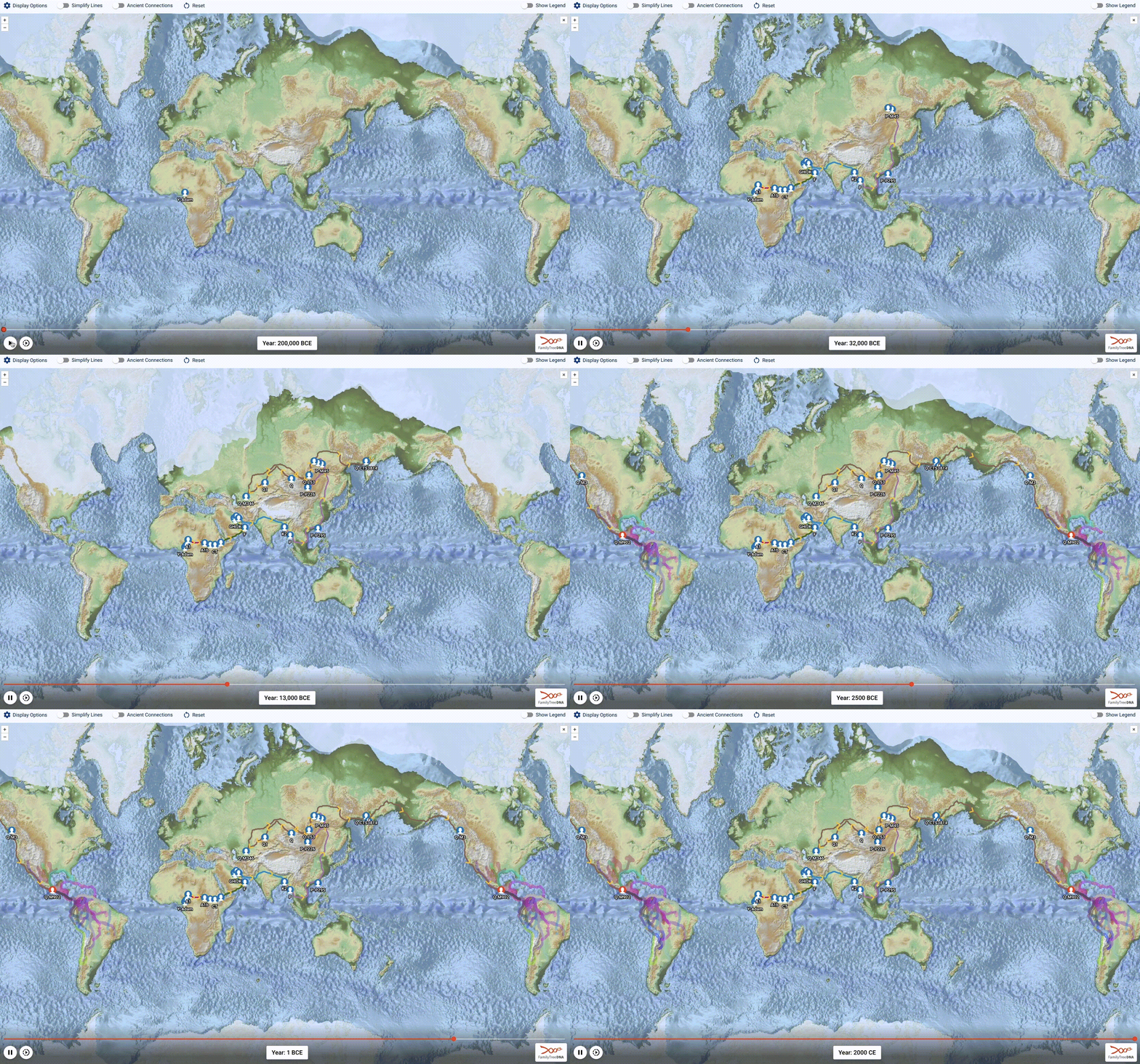
Phylogeography as a field dates to 1987, and it normally works on genome-wide population spread. Big Y customers are exploring something narrower and more tractable: a single patrilineal thread. The method had to place roughly 50,000 haplogroups on a map and then connect them, which is a different problem from placing one.
Step 1: rebuild the world as it was
A migration path drawn on today’s coastline is wrong for most of human history. Sea level has ranged from present levels down to 139 m lower at the glacial maximum 24,000 years ago, which is the difference between Beringia, Doggerland, Sundaland, and Sahul existing or not. Applying a past sea level to a global bathymetry layer reconstructs the shape of the continents at any chosen date. Glacial boundaries get the same treatment, since ice both blocked routes and, at times, opened them.
Water is not uniform either. Coastal movement, meaning anything within 200 km of land, is modeled as hugging the shore. Genuinely open-ocean routes are modeled against a layer of current speeds and directions, so a path can ride a current rather than cutting straight across it.
Step 2: filter aggressively, because the data is shared
The Big Y haplotree is collaborative, which means anyone’s data can affect everyone’s result. That is a strength, because it forces the method to ignore preconceptions, and a liability, because one bad coordinate propagates.
Several filters run before anything is placed. Country and haplogroup combinations that make no sense for pre-Columbian travel are dropped, so European R1b recorded in the United States does not drag a lineage across the Atlantic. Earliest Known Ancestor coordinates that conflict with the stated EKA country are removed, with a 500 km buffer for ordinary imprecision. Branches are checked for continental outliers. Finally the tree itself is filtered: any branch with only one geographically informative sample, or whose samples sit no closer than 2,000 km apart, is collapsed rather than allowed to steer a path.
Step 3: place the haplogroups
About 100 of the oldest branches are anchored to anthropological evidence. The other 50,000 are placed automatically, working from the leaves upward. Each leaf is anchored by a customer’s Earliest Known Ancestor coordinate, supplemented by roughly 2,000 ancient DNA samples, and every haplogroup above them starts out unknown.
The key decision is to compute a haplogroup’s position from its immediate downstream branches only, not from every sample beneath it. Consider a haplogroup where 60 percent of samples are British but three quarters of the immediate downstream branches are Scandinavian. Counting samples gives Britain; counting branches gives Scandinavia. Branches are the right answer, because sample counts reflect family size and testing rates rather than history.
The centre of those downstream points is a weighted median rather than a mean. With three points in Spain and one in Ukraine, a median respects the majority and stays in Spain; a mean lands in northern Italy, where nobody was. Weights matter too: shorter stems imply less elapsed time and therefore more information about the ancestor’s location, so they count for more. An ancient sample with a known findspot and a radiocarbon date close to the haplogroup’s own age carries substantial weight. If a centroid lands in water it is snapped back to the nearest contiguous land mass that actually holds descendants, ignoring fragments containing almost none.
Two refinements follow. Top-down smoothing uses a haplogroup’s grandparent to discipline its children, so one descendant found far from the family’s long history cannot drag the ancestor across a channel. TMRCA spacing corrects a bias that would otherwise make ancient ancestors appear to live where modern people live, since almost every sample is only a few generations old. Haplogroups between two anchors are spaced along the path in proportion to their estimated ages, except where samples dated close to a haplogroup argue against moving it.
Averaging all the resulting paths through a haplogroup gives a Mean Path Intersect, the final position. The spread around it becomes the uncertainty hotspot shown to users, which matters, because a single point on a map implies a precision this kind of inference does not have.
Step 4: connect them
People do not walk in straight lines over cliffs. Least cost paths connect placed haplogroups while avoiding steep slope on land, distance from shore in coastal water, and adverse currents in open ocean, with open ocean penalised heavily enough that paths stay on land unless the history genuinely was seafaring.
Least cost corridors then supply the confidence interval, showing the areas 95, 96.6, and 98.3 percent likely to contain the true route. That corridor method is adapted directly from the landscape genetics approach I published in Heredity for modeling toad movement between meadows, which is an odd but real line of descent from an alpine amphibian to a global map of human migration.
Technical details
Palaeo-environment layers combine global bathymetry with a sea-level curve to reconstruct coastlines per time slice, plus time-resolved glacial extents, distance-to-coast surfaces, and ocean current speed and direction fields. Costs are recomputed against whichever land surface existed at a haplogroup’s estimated age rather than against the modern one.
Placement runs bottom-up from leaves to anchors using a weighted median of immediate downstream branches, with stem-length weighting, country-frequency weighting for leaf-only nodes, and uncertainty weighting elsewhere. Off-land centroids are snapped to the nearest contiguous land mass holding more than a small share of downstream samples. Top-down smoothing and TMRCA spacing then refine the initial placement, and per-leaf paths are combined into a Mean Path Intersect whose spread becomes the displayed hotspot.
Routes are least cost paths over slope, distance-to-land, and current cost surfaces, with least cost corridors at three tiers giving the confidence bands. The corridor formulation follows the landscape genetics method in Heredity 129, 257–272.
Written up in three parts on the FamilyTreeDNA blog: the report, the method, which I wrote, and the history it reveals.
Archaic Origins
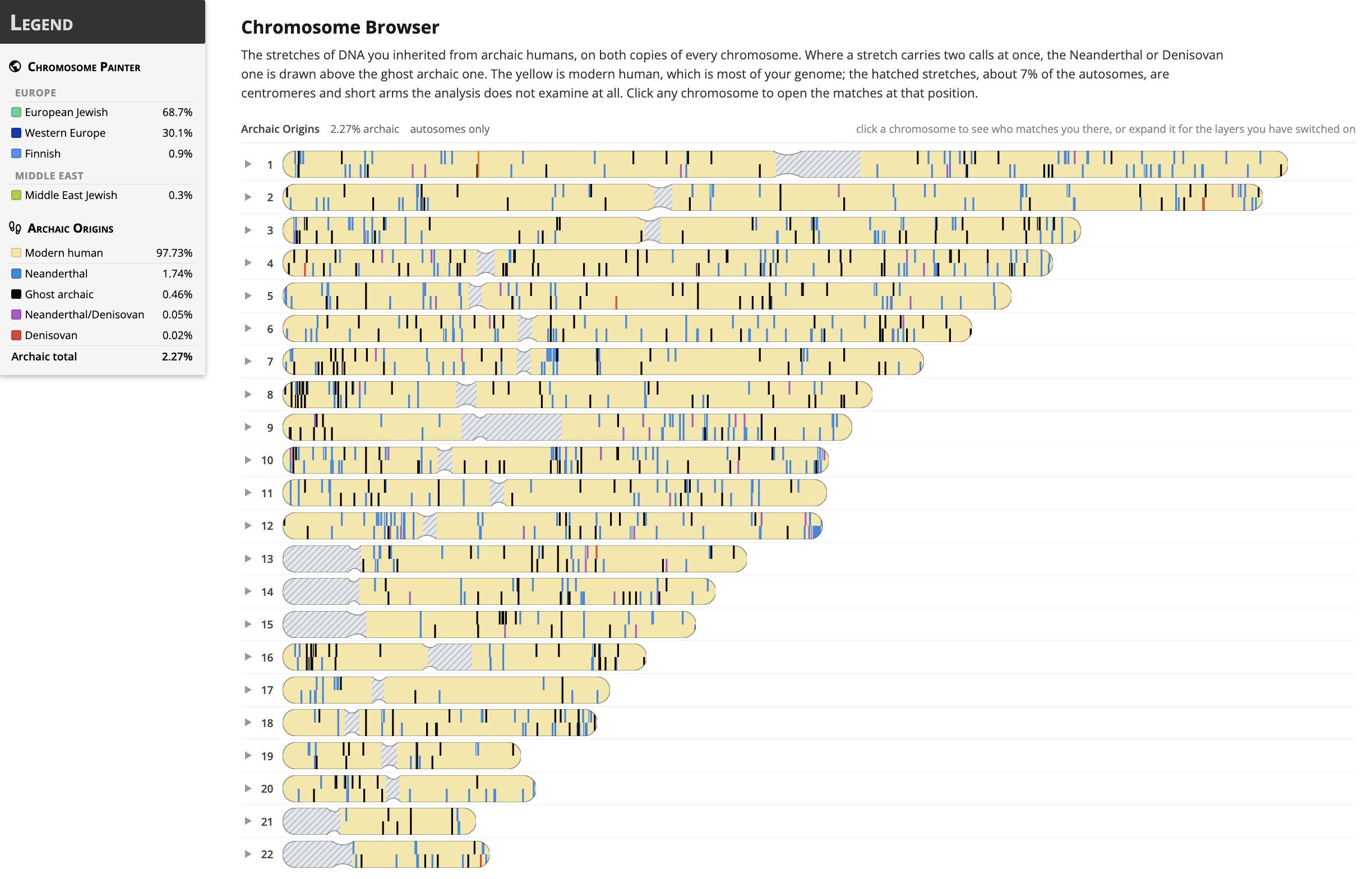
Nearly everyone outside sub-Saharan Africa carries a small fraction of Neanderthal DNA. People with ancestry in Oceania and parts of Asia also carry Denisovan DNA. And there is good evidence for at least one further archaic population that has never been sequenced and may never be, known only from traces it left in modern genomes.
Archaic Origins reports all three as calibrated percentages and per-chromosome segments. Neanderthal tracts are called against the high-coverage Vindija 33.19 genome, Denisovan tracts through a screened marker set, and the unsequenced ghost population by matching customer haplotypes against a catalogue of loci where its signature has been inferred.
Calibrating against something external
Detection methods for archaic ancestry systematically under-call. The tempting fix is to calibrate the pipeline against its own detector’s output, which produces internally consistent numbers that inherit the detector’s bias wholesale. We anchored to independent published estimates derived from entirely different statistics instead, so the calibration answers to something outside the pipeline.
Validation against published population ranges across six ancestry groups placed 12 of 13 cells in range, including held-out populations the calibration constants were never fitted to. That last clause is what separates validation from curve fitting.
Two screens found the hard way
Early runs had West Africans assembling Denisovan tracts, which is not a subtle error. Two filters fixed it: an African allele-frequency screen and a Denisovan-specificity screen. Together they cut the European spread from 1.53 to 4.32 Mb down to 0.70 to 0.99 Mb, tightening a distribution that had been far too wide to be real. A separate audit then caught overlapping segments double-counting base pairs, which forced a refit of every calibration constant.
Being explicit about what the numbers are not
Three limitations are documented rather than smoothed over, because each changes how a result should be read.
The ghost estimate is a population-level figure. Held-out testing on 80 people never used to build the catalogue gives segment precision and recall of 0.45 and 0.43 at the calling threshold, and 0.82 and 0.12 at the high-confidence tier. Per-person error exceeds real between-person variation, so the number describes a population well and an individual poorly, and it says so.
The three figures are not additive. Archaic segments overlap, so total archaic ancestry is a union rather than a sum. All three are reported against a diploid denominator so they are directly comparable, which required dividing out a factor of two for the ghost arm that the fitted slope absorbs automatically for the other two.
Ghost ancestry in Oceanians currently reads about three times too high, and we know exactly why. The published catalogue includes tracts for 92 Oceanian genomes, but the matching genotypes sit in separate controlled-access studies. Tracts alone say which loci carry ghost ancestry; without genotypes there is no carrier haplotype to compare a customer against, so those samples drop out of the panel. Fixing it requires either data access or re-running the upstream inference ourselves. Until then the limitation is stated rather than hidden.
Traits
Archaic variants that survive in modern genomes are interesting partly because some of them do something. The trait layer carries 137 curated variants across 109 loci, including EPAS1, the chromosome 3 COVID-19 risk haplotype, the TLR cluster, GHR, and SLC16A11. A call requires both tract overlap and an allele match on the same haplotype.
Getting there meant discarding most of the candidates. Of 839 candidate rows, 644 were dropped because the allele described in the literature as archaic is in fact the ancestral allele, which nearly every human carries. Reporting those would have returned a confident positive for almost every customer and told them nothing.
Technical details
Neanderthal tracts come from IBDmix against Vindija 33.19. Denisovan tracts come from
SPrime discovery with a two-tier screened marker set, weighted separately because
imputation panel retention differs several-fold between marker sources, with weights attached to
segments rather than individuals so that admixed people are handled correctly.
The ghost arm scores each haplotype window by its distance to known carriers minus its distance to non-carriers across a catalogue of roughly 19,239 loci, normalised by the window’s own diversity so that ordinary population ancestry cancels out of both terms. Calls are made at two thresholds, giving a standard tier and a high-confidence tier with very different precision-recall trade-offs.
Calibration anchors to published f4 and conditional random field estimates. Raw percentages use a 3.1 Gb denominator and final percentages a 6.2 Gb diploid denominator; for the Neanderthal and Denisovan arms the fitted slope absorbs the factor of two, while the ghost arm divides it out explicitly, so all three reported values are the same quantity. Output is stored in a tiered layout with roughly 11-fold BCF compaction so the cache scales with a cohort in the hundreds of thousands.
An African-archaic arm was tested and ruled out with a measurement, and two of three candidate routes for the ghost arm were retired the same way, each with the numbers written down so they do not get re-proposed.
White papers
- Maier P.A., Hu R., Runfeldt G., Giniebra D., Frichot E. (2021). myOrigins 3.0: combining global and local methods for determining population ancestry. FamilyTreeDNA White Paper. DOI · Page
- Hu R., Maier P.A., Runfeldt G., Estes R., Rocha E., Walker A., Baur P., Ty L. (2021). Family Finder Matching 5.0: matching algorithm and relationship estimation. FamilyTreeDNA White Paper. DOI · Page